
Eight wizards
jump quickly
over broken
fax machines.
Caruso Black
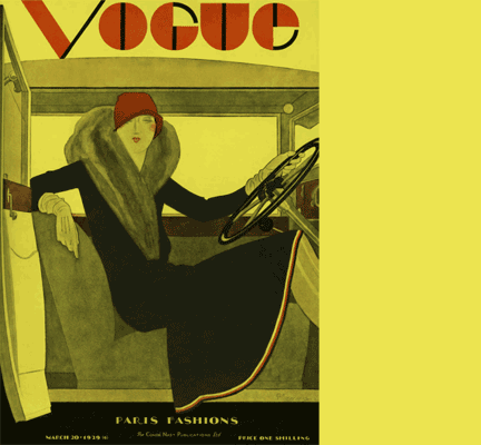
While the emerging Modernist look and the Art Deco look sat side-by-side during the late 1920s and 1930s, the Modernist look went on to massively influence all twentieth century design (and typefaces, leading to Helvetica in the 1960s), while the Art Deco look, although influential, has a definite date stamp. This must be because it's a bolder statement and so more prone to dating.
We all seem to have a 'soft spot' for Art Deco, so maybe sometime soon it will enjoy a revival of sorts.
Caruso Black is a sharp, geometric display font with an Art Deco flavour. Unlike Art Deco styles of the 1920s and 30s, it comes with full upper and lower case sets and accented characters for all Western and Central European languages making it a genuinely practical font. It's also available as an outline variation – Caruso White.
Find other fonts also tagged with:
angular / Art Deco / block / bold / clean / clear / contemporary / cosmetics / elegant / flowing / friendly / geometric / headline / heavy / impact / linear / logo / luxury goods / magazine / mechanical / metro / minimalist / modern / monoline / neon / nightclub / packaging / poster / retro / rhythm / rhythmic / sans serif / sharp / stylish / system